This post is about how to use Kmeans to classify various market regimes or to use Kmeans to classify financial observations.
Financial markets have the tendency to change their behavior over time, which can create regimes, or periods of fairly persistent market conditions. Investors often look to discern the current market regime, looking out for any changes to it and how those might affect the individual components of their portfolio asset allocation. Modeling various market regimes can be an effective tool, as it can enable macro-economically aware investment decision-making and better management of tail risks.
With K-means we are trying to establish groups of data that are homegenous and distinctly different from other groups. The K- stands for the number of clusters we will create.
The concept of distance comes in when deciding if a data point belongs to a cluster. The most common way to measure distance is the Euclidean Distance .
With multivariate data set, it is important to normalize the data.
Using R
Load up packages and read data
library (readr) # load and read .csv file library (glue) # concatenate strings together library (dplyr) # the tidy plyr tool for data wrangling library (tidyr) # to use the drop_na function <- here:: here ()<- read_csv (glue (the_path, "/raw_data/AMD.csv" )) |> rename (adj_close = 'adjClose' ) |> select (date, high, low, close, adj_close)glimpse (df)
Rows: 5,822
Columns: 5
$ date      <date> 2024-02-23, 2024-02-22, 2024-02-21, 2024-02-20, 2024-02-16,…
$ high      <dbl> 183.8000, 183.8300, 164.9000, 171.8100, 180.3301, 180.5000, …
$ low       <dbl> 176.9500, 172.0000, 161.8100, 162.0000, 173.2500, 175.2600, …
$ close     <dbl> 177.53, 181.86, 164.29, 165.69, 173.87, 176.76, 178.70, 171.…
$ adj_close <dbl> 177.53, 181.86, 164.29, 165.69, 173.87, 176.76, 178.70, 171.…
Feature engineering
library (TTR) # The technical analysis package <- aroon (df[, c ('high' , 'low' )], n = 23 )$ aroon <- yo[, 3 ]<- CCI (df[, c ('high' , 'low' , 'close' )], n = 17 )$ cci <- yo<- chaikinVolatility (df[, c ('high' , 'low' )], n = 13 )$ chaikinVol <- yo<- df |> select (date, aroon, cci, chaikinVol, adj_close) |> mutate (across (c (aroon, cci, chaikinVol), ~ as.numeric (scale (.)))) |> drop_na ():: skim (df1 %>% select (- date))
Data summary
Name
df1 %>% select(-date)
Number of rows
5797
Number of columns
4
_______________________
Column type frequency:
numeric
4
________________________
Group variables
None
Variable type: numeric
aroon
0
1
0.00
1.00
-1.49
-0.94
-0.19
0.90
1.65
▇▆▂▆▆
cci
0
1
0.00
1.00
-4.66
-0.78
-0.08
0.80
4.07
▁▂▇▅▁
chaikinVol
0
1
0.00
1.00
-2.49
-0.70
-0.11
0.59
4.40
▂▇▅▁▁
adj_close
0
1
25.52
32.97
1.62
5.70
12.14
26.00
162.67
▇▁▁▁▁
# also good to check for correlation between variables. library (corrr)|> select (- date, - adj_close) |> correlate () |> rearrange () |> shave ()
# A tibble: 3 × 4
  term          cci  aroon chaikinVol
  <chr>       <dbl>  <dbl>      <dbl>
1 cci        NA     NA             NA
2 aroon       0.564 NA             NA
3 chaikinVol  0.209  0.227         NA
These 3 variables seem to complete each other well as little to-no correlation.
Create clusters
library (purrr) #use the map function library (broom) #use the glance function on kmeans <- df1 %>% select (- date, - adj_close)<- tibble (k = 1 : 9 ) |> mutate (kclust = map (k, ~ kmeans (df1sc, centers = .x, nstart = 30 , iter.max = 50 L)), glanced = map (kclust, glance), augmented = map (kclust, augment, df1))|> unnest (cols = c ('glanced' ))
# A tibble: 9 × 7
      k kclust    totss tot.withinss betweenss  iter augmented
  <int> <list>    <dbl>        <dbl>     <dbl> <int> <list>
1     1 <kmeans> 17389.       17389. -6.55e-11     1 <tibble [5,797 × 6]>
2     2 <kmeans> 17389.       10193.  7.20e+ 3     1 <tibble [5,797 × 6]>
3     3 <kmeans> 17389.        8212.  9.18e+ 3     4 <tibble [5,797 × 6]>
4     4 <kmeans> 17389.        6658.  1.07e+ 4     4 <tibble [5,797 × 6]>
5     5 <kmeans> 17389.        5684.  1.17e+ 4     4 <tibble [5,797 × 6]>
6     6 <kmeans> 17389.        4790.  1.26e+ 4     5 <tibble [5,797 × 6]>
7     7 <kmeans> 17389.        4349.  1.30e+ 4     4 <tibble [5,797 × 6]>
8     8 <kmeans> 17389.        3922.  1.35e+ 4     5 <tibble [5,797 × 6]>
9     9 <kmeans> 17389.        3600.  1.38e+ 4     5 <tibble [5,797 × 6]>
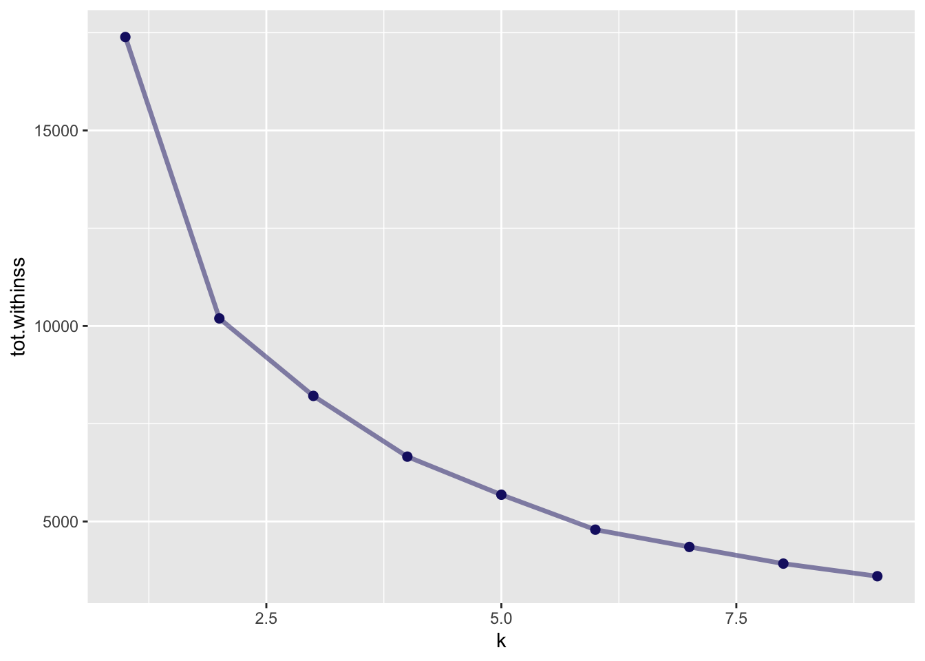
There are several ways to choose the ideal number of clusters. One of them is the elbow method, another one is the Silhouette Method.
The tot.withinss is the total within-cluster sum of square. This is the value used for the eblow method.
For the Silhouette Method, we can use the cluster package.
<- function (k) { <- kmeans (df1sc, centers = k, iter.max = 50 L)= cluster:: silhouette (kmeans_object$ cluster, dist (df1sc))mean (silh[, 3 ])# Compute and plot wss for k = 2 to k = 15 <- tibble (k_values = 2 : 9 ) |> mutate (avg_sil_values = map_dbl (k_values, avg_sil))
# A tibble: 8 × 2
  k_values avg_sil_values
     <int>          <dbl>
1        2          0.376
2        3          0.315
3        4          0.285
4        5          0.302
5        6          0.313
6        7          0.309
7        8          0.287
8        9          0.288
A more elegant way to do that, using this post from SO
<- kclusts |> mutate (silhouetted = map (augmented, ~ cluster:: silhouette (as.numeric (levels (.x$ .cluster))[.x$ .cluster], dist (df1sc)))) |> select (k, silhouetted) |> unnest (cols= c ('silhouetted' )) |> group_by (k) %>% summarise (avg_sil_values = mean (silhouetted[,3 ]))
# A tibble: 9 × 2
      k avg_sil_values
  <int>          <dbl>
1     1         NA
2     2          0.376
3     3          0.315
4     4          0.285
5     5          0.302
6     6          0.313
7     7          0.291
8     8          0.287
9     9          0.285
Some visualizations
Elbow method
library (ggplot2)|> unnest (cols = c ('glanced' )) |> ggplot (aes (k, tot.withinss)) + geom_line (alpha = 0.5 , size = 1.2 , color = 'midnightblue' ) + geom_point (size = 2 , color = 'midnightblue' )
Warning: Using `size` aesthetic for lines was deprecated in ggplot2 3.4.0.
ℹ Please use `linewidth` instead.
Based on the elbow method, I would be tempted to choose to 5 clusters (2 seems another obvious one).
Silhouette Method
|> ggplot (aes (k, avg_sil_values)) + geom_line (alpha = 0.5 , size = 1.2 , color = 'midnightblue' ) + geom_point (size = 2 , color = 'midnightblue' )
Warning: Removed 1 row containing missing values or values outside the scale range
(`geom_line()`).
Warning: Removed 1 row containing missing values or values outside the scale range
(`geom_point()`).
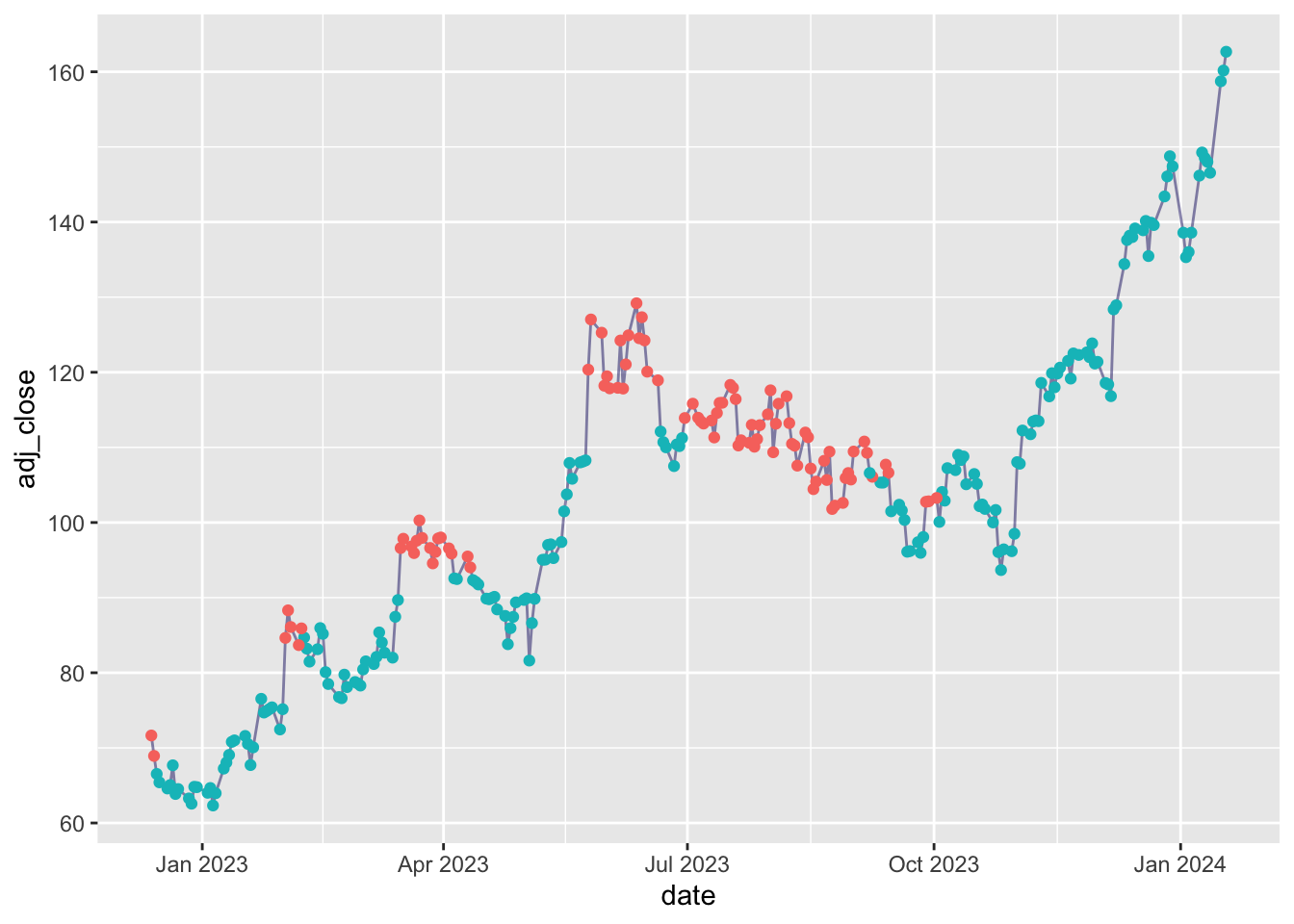
2 is the winner ;-)
Plotting the stocks with clustered observations
library (lubridate)<- kmeans (df1 |> select (- date, - adj_close), centers = 2 )augment (yo, df1) |> filter (date >= today () - 500 ) |> ggplot (aes (x = date, y = adj_close)) + geom_line (alpha = 0.5 , color = 'midnightblue' ) + geom_point (aes (color = .cluster)) + theme (legend.position = 'none' )
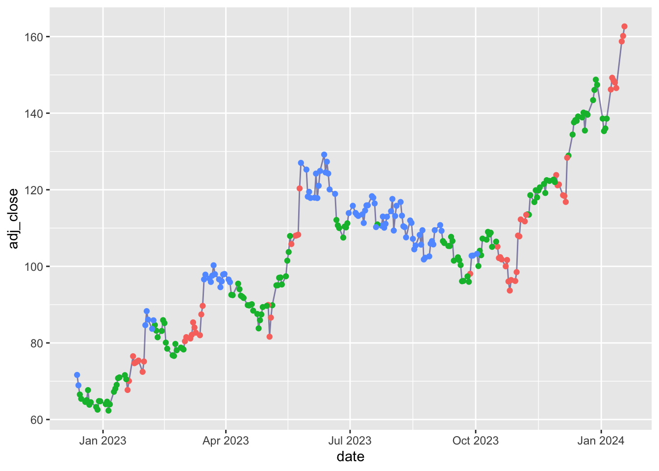
<- kmeans (df1 |> select (- date, - adj_close), centers = 3 )augment (yo, df1) |> filter (date >= today () - 500 ) |> ggplot (aes (x = date, y = adj_close)) + geom_line (alpha = 0.5 , color = 'midnightblue' ) + geom_point (aes (color = .cluster)) + theme (legend.position = 'none' )
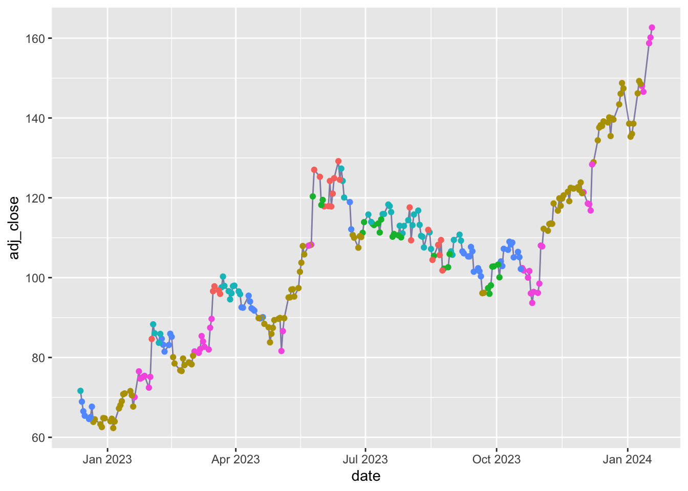
<- kmeans (df1 |> select (- date, - adj_close), centers = 6 )augment (yo, df1) |> filter (date >= today () - 500 ) |> ggplot (aes (x = date, y = adj_close)) + geom_line (alpha = 0.5 , color = 'midnightblue' ) + geom_point (aes (color = .cluster)) + theme (legend.position = 'none' )
Using python
Original blog post
import yfinance as yf #only to download data = yf.download("AMD" )"../../raw_data/AMD.csv" )
import pandas as pd= pd.read_csv("../../raw_data/intc.csv" , names = ['date' , 'open' , 'high' , 'low' , 'close' , 'adj_close' , 'volume' ]).iloc[1 : , :]= py_df.melt(id_vars = 'date' , value_vars = ['open' , 'high' , 'low' , 'close' ], value_name = 'prices' , var_name = 'price_point' )
Let’s graph the last year of data
import matplotlib.pyplot as plt= ta_df.tail(250 ).copy()'adj_close' ] = py_df['adj_close' ]'date_time' ] = pd.to_datetime(ta_df2['date_time' ], utc= True )'adj_close' ] = pd.to_numeric(ta_df2['adj_close' ])= plt.figure(figsize = (12 , 8 )) = fig.add_gridspec(3 , hspace= 0 )= gs.subplots(sharex= True )#plt.figure(figsize = (12, 8)) 0 ].plot(ta_df2['date_time' ], ta_df2['adj_close' ])0 ].set_ylim(25 , 55 )#axs[0].set_title('INTC price') 1 ].plot(ta_df2['date_time' ], ta_df2['aaron' ], 'tab:green' )1 ].set_ylim(- 105 , 105 )#axs[1].set_title('Aaron ind.') 2 ].plot(ta_df2['date_time' ], ta_df2['ht' ], 'tab:red' )2 ].set_ylim(- 50 ,320 )for ax in axs:
from sklearn.metrics import silhouette_scorefrom sklearn.cluster import KMeans= []= []'date_time' )for n_clusters in range (2 , 14 ): = KMeans(n_clusters = n_clusters, random_state= 0 )= kmeans.fit_predict(ta_df)/ n_clusters)= pd.DataFrame({n_clusters: range (2 , 14 ), "inertia" : inertia})= pd.DataFrame({n_clusters: range (2 , 14 ), "sil_score" : sil_score})print (inertias)print (sil_scores)